

OMG you guys!! 😱 I am literally writing this at 5 AM because I just fell down the absolute deepest rabbit hole on Instiz and I am SHAKING. You know how we’re always debating which phone has the better camera for those late-night Han River aesthetics? Well, the conversation just shifted, and it shifted HARD. We aren’t just talking about megapixels anymore; we are talking about the actual soul of the device. I was scrolling through a post titled “Galaxy vs. iPhone colors that are currently splitting opinions based on aesthetic taste,” and let me tell you, the 30,000 people who viewed it within hours are not holding back. It’s 2026, and the ‘Aesthetic War’ has reached a level of pettiness that I am honestly here for. 💀
No but like, hear me out. For the longest time, the unwritten rule of Seoul street style was basically: if you want that “emotional” (gamseong) vibe, you go iPhone. If you want utility, you go Galaxy. But looking at these 2026 renders and real-life shots? The lines are getting so blurry it’s giving me a headache. Samsung has clearly been hiring some Gen-Z consultants because their new color palette is hitting in a way that feels dangerously trendy. I saw one user on Instiz comment, “Is it just me or is Galaxy starting to look more like a fashion accessory than a piece of tech?” and honestly? Same. The way the light hits these new finishes is making everyone question their loyalty to the Apple ecosystem.
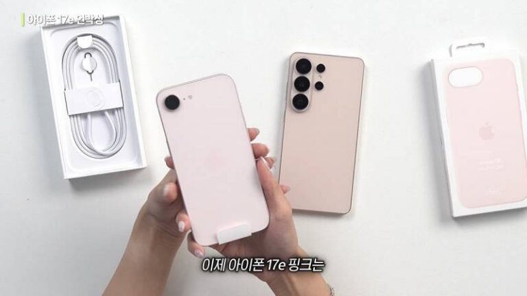
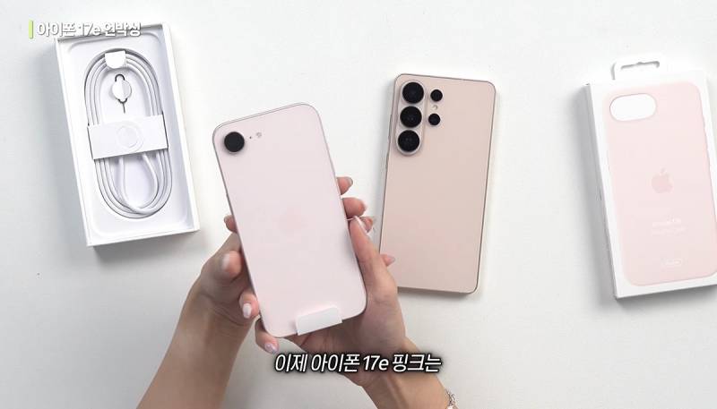
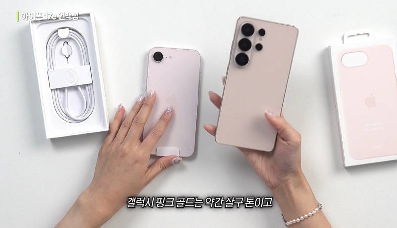
The Instiz Post That Started the Fire
The post that’s currently breaking the Korean internet (nearly 30k views and counting!) is comparing the latest color science from both giants. It’s not just a “which is prettier” poll; it’s a deep dive into how these colors make you feel. The Korean term used was “midam” (aesthetic sense), and fans are literally drawing battle lines. One side is arguing that Apple has perfected the “clean girl” aesthetic with their muted, sophisticated tones, while the other side is obsessed with Galaxy’s bold, “cyberpunk Seoul” energy. It’s the ultimate showdown of minimalism versus expressionism.
The comments section is a literal war zone, but in the funniest way possible. You have the long-time iPhone stans who refuse to budge, and then you have the “Galaxy converts” who are basically saying that Samsung finally understood the assignment. One top comment really sent me: “I’ve used iPhone for 10 years for the ‘vibe,’ but seeing that new Galaxy blue in person made me realize I’ve been living in a beige prison.” I’m deceased. The drama is real, and it’s all about that specific saturation level that makes your mirror selfie look like a high-end magazine spread.
“iPhone’s white is still the standard for that ‘clean’ look, but that new Galaxy blue is calling my name. It feels like a piece of jewelry.” — Instiz User #42
iPhone’s 2026 ‘Emotional’ Color Theory
Let’s talk about the Apple side of things first. This year, Apple seems to be leaning even further into what I call “expensive neutrality.” You know that specific shade of grey that looks like it belongs in a $10 million loft in Hannam-dong? That’s the vibe. It’s very “quiet luxury.” They aren’t trying to scream for attention; they know they already have it. The 2026 iPhone colors are all about depth and texture. The way they’ve layered the glass makes the color seem like it’s floating. It’s very ethereal, very “I drink oat milk lattes and read poetry.”
The problem is, some fans are starting to find it a bit… boring? Not me (I still love a good neutral), but the community is definitely split. Some people are saying it’s giving “hospital chic,” while others think it’s the pinnacle of design. There’s a certain “trust” that comes with iPhone colors. You know exactly how it’s going to look under the fluorescent lights of a 24-hour convenience store, and you know it’ll look even better during golden hour at Namsan Tower. It’s reliable aesthetic insurance.
Galaxy’s Redemption Arc: The Cyberpunk Seoul Vibe
Now, let’s get into the Galaxy of it all. Can we talk about this glow-up? Samsung has spent the last few years trying to shake off that “business phone” reputation, and in 2026, they finally did it. The new colors are vibrant, daring, and honestly? A little bit chaotic in the best way. They’ve introduced these finishes that change color depending on the angle, which is so incredibly “Seoul at night.” It’s giving neon lights, it’s giving Seongsu-dong pop-up store, it’s giving main character energy.
What’s really interesting is how they’re targeting the Gen-Z crowd. They aren’t just releasing “Blue” or “Pink.” They are releasing shades that feel curated for specific subcultures. There’s a certain “dusty lilac” that is literally the exact color of the most popular blush in Korea right now. They are matching the tech to the makeup trends, and that is a level of marketing genius I have to respect. It’s no wonder the Instiz post is going wild; people are seeing their own personal style reflected in a piece of hardware.
“Galaxy finally figured out the ‘young’ aesthetic. My iPhone is sweating. I never thought I’d say this, but I’m actually considering switching for the color alone.” — Anonymous Instiz Post
The Mirror Selfie Factor
Okay, we need to talk about the most important metric of 2026: The Mirror Selfie. 🤳 If your phone color clashes with your OOTD (Outfit Of The Day), did you even take a photo? This is where the “midam” split really happens. iPhone users argue that the neutral tones of the iPhone 17 series act as a perfect backdrop for any outfit. It’s like a white t-shirt; it goes with everything. You can wear a bright red Ganni dress or a monochrome techwear fit, and the iPhone will just… fit in.
But the Galaxy crowd? They are using the phone as the statement piece. They want that pop of color to be the first thing people notice. In the Instiz comments, people were literally sharing photos of their outfits and asking which phone color would match better. It’s becoming a part of the fashion coordination process. I saw one girl on TikTok who matched her entire room aesthetic to the new Galaxy “Midnight Aurora” shade, and honestly? It was a mood. The phone isn’t just a tool anymore; it’s the final touch to your look.
Why Korean Fans are Losing It
The reason this specific post has 82 comments (and counting) is because in Korea, your phone is a huge part of your social identity. It sounds extra, I know, but it’s true! Whether you’re a “Galaxy person” or an “iPhone person” says a lot about your vibe. Seeing Samsung close the aesthetic gap so aggressively is causing a bit of an existential crisis for the “gamsong” purists. They can’t use the “Galaxy is ugly” excuse anymore, and they are PANICKING.
One of the most debated points in the comments was the “color temperature” of the actual hardware. Fans are analyzing the microscopic differences between Apple’s “Starlight” and Samsung’s “Cream.” One user wrote a literal paragraph about how Apple’s cream has more blue undertones which makes it look “cooler” in photos, while Samsung’s has a warm, “vintage” feel. The level of detail is insane! But that’s why I love our community—we care about the things that actually matter, like whether our phone makes our skin look washed out in a reflection.
“Can we talk about how the Galaxy S26 series literally matches my favorite cafe’s interior?? It’s like they designed it for Instagram.” — Instiz User #19
The Idol Influence: Who’s Carrying What?
Of course, we can’t talk about phone trends in 2026 without mentioning the idols. We’ve seen a huge shift recently. While the “iPhone dominance” among idols was a thing for years, more and more stars are being spotted with custom-colored Galaxies. It’s becoming a bit of a flex to have a phone that stands out. When a member of a top-tier girl group (no names, but you know who!) was seen with that specific matte-finish Galaxy at Incheon Airport last week, the search terms for that color spiked by like 400%. It’s the power of the “it-girl” stamp of approval.
But Apple isn’t backing down. They’ve been doubling down on their “artist” collaborations, making sure the iPhone remains the choice for the “creative soul.” It’s a battle of the brand ambassadors, and we are just living in it. Every time a new mirror selfie drops on Instagram or Weverse, the first thing fans do is zoom in on the phone. “Is that the new Titanium Grey?” “Wait, is she using the Galaxy Flip 8 in Mint?” The obsession is real, and it’s driving the market in ways we’ve never seen before.
The Verdict: Is There a Winner?
So, where do I stand on all this? Honestly? I’m torn. I’ve been a loyal iPhone girl since forever, but these Galaxy colors are making me feel things I didn’t know I could feel for a piece of tech. 😭 It really comes down to what your “midam” is. If you want that timeless, effortless, “I just woke up like this” vibe, iPhone is still your best bet. It’s a classic for a reason. It’s the Chanel flap bag of phones.
But if you’re someone who lives for the trend, someone who wants their tech to be as loud and expressive as their fashion, the 2026 Galaxy lineup is winning. It’s bold, it’s new, and it feels like the future of Seoul style. Samsung stopped trying to copy Apple and started trying to out-style them, and honestly? It’s working. The Instiz community might be divided, but that just proves that both brands are finally delivering something worth fighting over.
The bottom line is that we’re spoiled for choice. Whether you want the “emotional” minimalism of Apple or the “cyberpunk” energy of Samsung, you’re going to look good. Just make sure you pick the one that matches your favorite lip tint, because that’s the real 2026 priority. Anyway, I’m going to go back to refreshing the comments to see if anyone has posted a real-life comparison of the “Rose Petal” pink. I might have to make a very expensive decision soon… don’t tell my bank account! 💸✨
What about you guys? Are you Team iPhone Sensibility or Team Galaxy Trendsetter? Does the color of your phone actually change how you feel about your whole vibe? I NEED TO KNOW. Drop your thoughts in the comments! 👇