


OMG You Guys, We Need to Talk About This Right Now
I am literally screaming into my pillow as I write this because I just can’t believe the drama I’m seeing on my feed today! Nowadays, you’d think we’ve seen every possible K-pop controversy under the sun, but then something like this happens and resets the whole clock. So, I was doing my usual 3 AM deep dive into TheQoo (don’t judge me, it’s where the real tea is spilled) and I found a post that is absolutely EXPLODING. I’m talking over 49,000 views and nearly 900 comments in just a few hours. The topic? A new logo for a BTS event at Gwanghwamun that has people… well, let’s just say they are NOT happy. The original poster called it “unfortunate,” and honestly? I can see why the vibes are feeling a little bit off for some people.
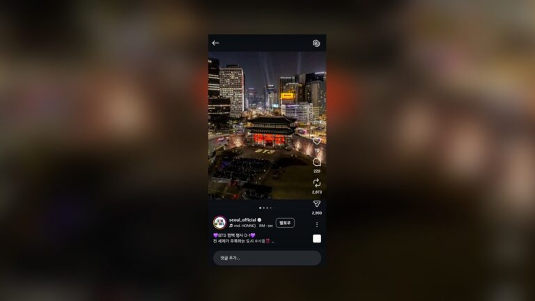
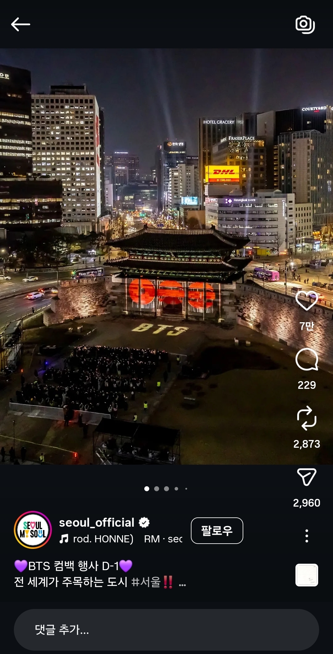
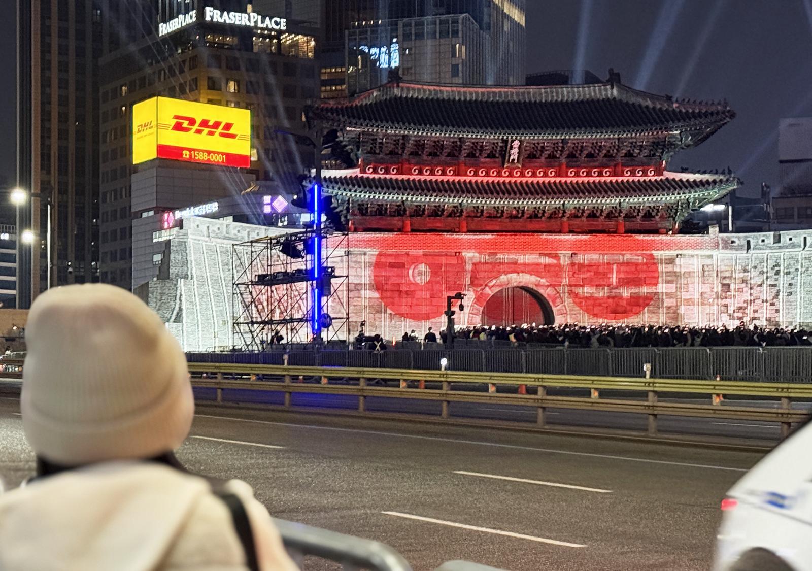
Basically, BigHit (or HYBE, or whoever is running the show this week) dropped this new branding for a massive BTS event happening right in the heart of Seoul—the legendary Gwanghwamun Square. Now, Gwanghwamun isn’t just some random street corner; it’s the literal soul of Korea. It’s where history meets the modern world, and it’s a place of massive national pride. So when you drop a logo there that even *slightly* hints at something controversial, the internet is going to come for you with receipts. The drama is centered around the radiating lines in the design, which some netizens are saying looks way too much like a certain historical flag that carries a lot of trauma in East Asia. I’m sitting here looking at the screen like, “Wait, did nobody in the design meeting catch this?”
The Design Breakdown: Why Everyone Is Losing It
Okay, let’s look at the actual art for a second. The logo features these sharp, radiating lines coming out from a central point, meant to represent the “light” or “energy” of BTS at the center of Seoul. In theory, that sounds like a total slay, right? It’s giving main character energy. But the way those lines are spaced and the way they fan out has triggered a massive wave of “Rising Sun” flag comparisons. For those who don’t know, that’s a huge, huge deal in Korea because of the historical context with Japan. Even if it was a complete accident—which, let’s be real, it probably was—the visual association is enough to make anyone do a double-take. It’s like the designers were going for “shining star” but ended up in “historical controversy” territory by mistake.
What makes this even crazier is that BTS is literally the pride of the nation. They are the ones who represent Korea on the global stage! So for a logo associated with them to be called “unfortunate” or “unpleasant” on a platform like TheQoo is a major vibe shift. I’ve seen fans arguing that the lines are actually supposed to represent the roof of a traditional Korean palace or the gates of Gwanghwamun, but the execution is just… messy. When you have to explain the art for it not to look like a red flag (literally), you know you’ve got a branding problem on your hands. The comments are a total battlefield right now, and I’m just here with my popcorn watching it all go down.
“I actually gasped when I saw this. How did this pass through ten layers of approval? It’s giving Imperial Japan vibes and I’m not here for it at all. Especially at Gwanghwamun of all places?!”
— Top Comment on TheQoo
The Netizen Reaction: A Total House of Fire
The comment section on that post is a literal war zone, y’all. I haven’t seen K-nets this divided since… well, since yesterday, but this feels different. It’s not just the usual antis being loud; it’s actual fans and neutral citizens feeling uncomfortable. One user pointed out that the scale of the radiating lines makes it impossible to ignore the resemblance, while others are defending the creative team, saying people are being way too sensitive. But honestly? In Korea, you can’t really be “too sensitive” about this specific imagery. It’s a deep-rooted thing. The fact that this post hit 49,000 views so fast shows that this isn’t just a small group of people complaining; it’s a legitimate viral moment that HYBE is going to have to address if they don’t want this cloud hanging over the event.
Some of the comments are lowkey heartbreaking because fans are worried this will reflect badly on the boys. We know BTS has nothing to do with the day-to-day graphic design of their event banners, but their name is the one on the poster! I saw one fan say, “I’m literally shaking because I don’t want the boys to get hate for a mistake a staff member made.” And honestly? Same. The way the industry works, the idols always end up taking the heat for the corporate side’s blunders. By now, we should be past these kinds of design oversights! I’m just wondering if there’s a secret intern somewhere who’s having a very bad day right now because the backlash is getting louder by the second.
Is It Just a ‘Gate’ or Something More?
Now, let’s look at the other side of the coin. Some people are saying that if you look at the logo from a certain angle, it’s clearly supposed to be the Gwanghwamun gate itself, with the lines representing the sunbeams hitting the historical architecture. If you squint—and I mean really, really squint—you can kind of see it. The problem is that in graphic design, first impressions are everything. If the first thing 50,000 people think is “flag” and not “palace gate,” then the design has failed its primary mission. It’s all about the semiotics, you know? The way we interpret symbols is based on our collective memory, and for Koreans, those radiating lines are loaded with meaning.
I also saw some fans trying to compare this to previous BTS logos, like the iconic “door” logo they’ve used for years. That logo was a masterpiece of minimalism—simple, clean, and impossible to misinterpret. This new Gwanghwamun logo feels like it’s trying too hard to be “epic” and “grandiose,” and it just lost the plot along the way. It’s a classic case of over-designing. Sometimes less is more, especially when you’re dealing with sensitive cultural locations. I’m lowkey hoping they just pull the banners and do a quick redesign before the actual event starts, because the last thing we need is a protest at Gwanghwamun over a logo.
“If you have to write a 5-paragraph essay to explain why a logo ISN’T offensive, then the logo is already a failure. Just change it and move on before this becomes a global headline.”
— Twitter/X User @KpopVibeCheck
The Current Context: Why This Hits Different Now
We have to remember that nowadays, the relationship between K-pop and national identity is stronger than ever. BTS isn’t just a boy band anymore; they are a cultural institution. When they do an event at Gwanghwamun, it’s basically a state affair. This isn’t like a concert in a random stadium; it’s a statement. That’s why the scrutiny is so much higher. People expect perfection because BTS represents the best of Korea. Anything that muddies that image, even a poorly designed logo, feels like a personal affront to some people. It’s a heavy burden to carry, and it’s why the creative directors at these big companies need to be more careful than ever.
I’ve also noticed that the “cancel culture” in the design world has become so much faster. Back in the day, a logo might be out for weeks before anyone noticed a problem. Now? It takes exactly five minutes for someone on TheQoo to spot a pixel out of place and start a viral thread. The speed of information is just insane. I’m honestly impressed by how eagle-eyed these fans are. They notice things I wouldn’t even see if I was staring at it for an hour! But that’s the power of the K-pop fandom—they are the ultimate gatekeepers of the brand’s integrity, for better or for worse.
My Hot Take: What Should Happen Next?
Okay, here is my unfiltered, 100% Jenny opinion: HYBE needs to pivot, and they need to do it FAST. This isn’t one of those things that’s just going to blow over in a couple of days. Once the “flag” comparison is out there, you can’t unsee it. Every time a fan takes a selfie in front of that banner at Gwanghwamun, that controversy is going to be in the background. Is that really the vibe we want for such a historic event? Absolutely not. They should just come out, say “Hey, we hear you, the design was meant to represent the sun but we see how it’s being interpreted,” and then drop a new, sleeker version. It would actually be a huge win for them to show they’re listening to the fans.
And honestly? I’m kind of tired of these big companies playing it safe with “minimalist” designs that end up looking generic or accidentally offensive. Give us something bold! Give us something that actually feels like BTS! This logo feels a bit corporate and cold, which is the opposite of what the boys are all about. I want to see colors, I want to see soul, I want to see something that makes me go “WOW” for the right reasons. Not something that makes me spend my whole night translating angry comments on a forum! But hey, that’s just me. I’m just a girl who wants her faves to shine without any unnecessary drama.
“Not the radiating lines again… didn’t we learn this lesson years ago? Please, someone hire a history consultant for the design team. This is so exhausting for the fans who have to defend it.”
— Anonymous Instiz User
Wrapping It Up (For Now)
So, what do y’all think? Am I just overthinking this, or is the internet right to be a little bit weirded out by the design? It’s such a fine line between “artistic expression” and “cultural insensitivity,” and it seems like this logo stepped right over it. I’ll be keeping my eyes glued to the official channels to see if there’s a response or a sneaky midnight redesign. You know I’ll be the first to tell you if something changes! For now, I’m going to try and get some sleep, but I already know I’m going to be dreaming about radiating lines and blue-and-white banners. The life of a trend hunter never stops, even when the news is this stressful!
Drop your thoughts in the comments! Do you see the flag, or is it just a gate to you? I need to know if I’m the only one who’s lowkey stressed about this! 👇✨